Mechanistic Interpretability is a field of study that concerns study of neural networks (more generally ML models) with an intent to understand and explain inner workings of a machine learned model. This has particularly become important due to the rise of deep learning and neural network based techniques which learn from large datasets through supervised and self-supervised means leading to super-human performance, beating human baselines in many cases. More recently, Transformer architecture based LLMs have revolutionized AI as being general reasoning machines that can not just learn from text data but understand multi-modal data (vision and speech included) mimicking vaguely how humans sense the world and respond to stimuli. This is already enough justification to invest in interpretability research so we have sufficient oversight on benefits and harm these models can have on our society. LLMs are notoriously known for hallucinating facts in QA, imagine if we somehow could peek into the activations to identify node(s) that are active when a model is hallucinating, we could have interventions that can prevent them in first place.

Mechanistic interpretability is akin to reverse-engineering the model to comprehend its “thought” processes. This is an active area of research in AI, with techniques like layer-wise relevance propagation, saliency maps, and attention mechanisms being explored to provide insights into the inner workings of complex models
This rest of the article is roughly divided into two phases
(i) Reasons why we need this research and
(ii) Recent work and findings from this research in the context of LLMs. Specifically, we discuss recent works from Deepmind and MIT/Meta.
Why do we need to study interpretability ?
- Bias and Alignment with Human Values: The pursuit of mechanistic interpretability is essential in ensuring that AI systems operate without bias. It is paramount that AI decisions are aligned with human values, particularly concerning sensitive characteristics such as age and gender. For example, in the recruitment domain, it is crucial that job applicants are evaluated based on their qualifications rather than discriminatory factors — a goal that requires careful scrutiny of the training data to prevent inherent biases, such as a model that has learned to prefer one gender over another due to biased historical hiring practices.
- Trustworthiness of AI Systems: We need to study mechanistic interpretability to cement the trustworthiness of AI systems. By understanding the internal mechanics of AI decision-making, we ensure that these systems can be relied upon without skepticism. Trust in AI is not a given; it is built on the clarity and justifiability of its processes and outputs.
- Factuality Over Fabrication: AI systems must be designed to adhere to facts and resist the temptation to ‘hallucinate’ or fabricate information. Mechanistic interpretability studies the AI’s decision-making process to guard against the creation of convincing yet untrue facts, which could otherwise mislead individuals and propagate misinformation.
- Regulatory Compliance in High-Stakes Fields: In sectors where the stakes are particularly high, such as finance, the demand for explainable AI is not just practical but regulatory. For instance, if a loan application is denied, regulatory frameworks mandate that the decision be transparent and explainable to the customer. This requirement ensures that a deep learning model’s high-confidence prediction of a loan default is accompanied by a rational and understandable explanation.
- Enhancing Human Efficacy and Discovery: Finally, studying mechanistic interpretability has the potential to amplify human intellect by unraveling complex concepts that have yet to be discovered. This can lead to significant advancements in various fields, such as improving healthcare treatments and interventions, by leveraging AI’s ability to identify patterns and correlations beyond human discernment.
Recent Work on Mechanistic Interpretability
“Bridging the Human–AI Knowledge Gap: Concept Discovery and Transfer in AlphaZero” is a paper from Google Deepmind, where authors study the behavior of AlphaZero to understand novel concepts in the way it plays the game of chess. AlphaZero is an AI system that mastered the game of chess via self-play without human supervision. They particularly choose AI that knows to play chess, as it is a game that is well understood and groundtruth is much easier to validate unlike science or medicine. There is also a quantitative measure of the quality of play, both for human experts as well as machines, known as the Elo rating.
They motivate the need for humans to learn from machines with an example of a system capable of producing a more accurate cancer diagnosis or effective personalised treatment than human experts is useful, transferring the rationale behind their decisions to human doctors could not only bring advances in medicine but also leverage human doctors’ strength and generalisation ability to enable new breakthroughs.
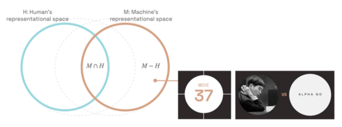
The human representational space (H) has some overlap with the machine representational space (M). A representational space forms the basis of and gives rise to knowledge and abilities, which is of ultimate interest. Authors use representational space and knowledge interchangeably roughly speaking, H to represent what humans know and M to represent what a machine knows. There are things that both AI and humans know (M intersect H), things that only humans know (H-M), and things only machines know (M-H). Most existing research efforts only focus on (M intersect H). Authors posit that the knowledge gap represented by (M-H) holds the crucial key to empowering humans by identifying new concepts and new connections between existing concepts within highly performant AI systems.
One prominent example in the history of AI is the move 37 that AlphaGo made in a match with Lee Sedol. This move came as a complete surprise to the commentators and the player, and is still discussed to this day as an example of machine-unique knowledge. The vision to pursue super-human knowledge is ultimately for human-centered AI, and a world where human agency and capability do not come second.
Authors show a methodology to mine novel concepts from AlphaZero, ensure they are teachable concepts to humans and verify the knowledge transferability by working 4 chess grandmasters, the best chess players in the world.
Another popular and recent paper in this space includes “LANGUAGE MODELS REPRESENT SPACE AND TIME” from MIT, where authors study Llama 2 models on spatial (world, US, NYC) and temporal datasets(historical figure, news, artwork) and find LLMs learn linear representations of space and time across multiple scales. These representations are robust to prompting variations and unified across different entity types (e.g. cities and landmarks). Further they go on to conclude that modern LLMs acquire structured knowledge about fundamental dimensions such as space and time, supporting the view that they learn not merely superficial statistics, but literal world models.
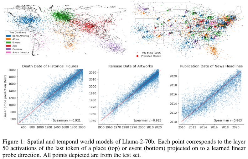
Below are some highlights of the paper
- Train linear regression probes on the internal activations of the names of these places and events at each layer to predict their real-world location or time.
- These representations are linear (R2 does not support non-linearity), robust to prompting and unified across entities (cities and natural landmarks)
- The probe learns the mapping from model coordinates to human interpretable coordinates.
- What is probing ? fits a simple linear ridge regression model on the network activations to predict some target label associated with labeled input data. In particular, given an activation dataset A and a target Y containing either the time or two-dimensional latitude and longitude coordinates.
- The early layers (25%) are responsible for recall of information.
- Adding non-linearity in the fitted model doesn’t change the explained variance wrt linear model indicating the presence of linear relationship.
- Robust to prompting strategies
In conclusion, the imperative to study and advance mechanistic interpretability is clear. By unpacking the ‘black box’ of AI, we ensure that the technology we increasingly rely on operates in a manner that is ethical, understandable, and beneficial. MI is an active area of research, that is extensively studied by OpenAI, Anthrophic, Google and other teams building world models that serve as a backbone for futuristic AGI solutions.


